Midnight Navy Tri-Blend Jersey- 32 Single 145g/4.3oz 50% Poly 25% Combed Ring-Spun Cotton 25% Rayon.
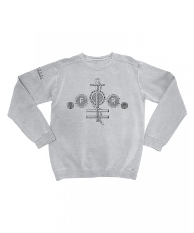
This past fall, as preparations for the release of it's not us were underway, we came across the work of Michael Hamad. Michael is the creator of Setlist Schematics, a tumblr blog with visual representations of live shows and studio albums. He has a PH.D in musicology, a masters in music theory, is a musician, journalist and is an avid music fan. (Translation: The guy knows his stuff.) Michael took on the task of creating an "alternate album cover" for it's not us, a visual theory-based map of the music. We turned them into t-shirts which you can order now!
From the horses mouth:
My idea was this: what if the grooves of an LP, in addition to capturing the recorded sounds, could *show* you what you happens on an album?
Each of the 11 tracks appears as a sort of spoke in a wheel, beginning at the center and moving toward the perimeter. The first track, "The Silent Type," begins just to the right of 12 o'clock, and the rest of the album unfolds clockwise.
Each song starts with a giant letter (D, E, B, G, and so on), indicating the key. Longer tracks occupy the same length (from center to edge) but take up more vertical space, and thus have a greater density (more musical information per inch).
I dropped lyrical incipits ("lay here on the floor," "so my conscience said") here and there to help you get oriented. Plus, lyrics just look cool, all mixed together with Roman Numerals (indicating chord functions), Arabic numbers (pitch content above the bass), descriptive terms (sync, riff, groove, build, dip, etc.) and whatever else occurs to me while I listen. Other than geometric shapes, no two lines are touching.
Here are some basic instructions on how to read schematics: Every mark in the design means something. If we sat down and listened together, I could walk you through it. (But who wants someone talking over a really good album?)
I knew UM fans would dig the level of music analysis I put into my designs. We're talking about a highly musically literate group of people, listeners who go to shows expecting to hear metric and harmonic complexity and seat-of-pants improvisation.
Still, it all has to make sense visually, and that's always a challenge. I never know how a schematic is going to look until it's finished, but I'm pretty happy with how this one turned out.


 Security policy - Secure Transactions by 256-bit encryption
  Delivery policy - Leaves Warehouse in 1-2 business days
 Return policy - 30 Days Free Exchange & Return Policy